
What Your Garmin Swim Data Really Says: Four Years, 813 km, One Honest Read
Your watch records everything and shows you almost nothing. I mirrored four years of my own Garmin data into a database and read it properly: pace, SWOLF, heart rate, VO2max. Here is what the numbers actually say, and how to read yours without fooling yourself.
Your Garmin knows almost everything about your swimming. It has every length, every stroke, every heartbeat, going back years. What it shows you is a summary of your last session and a weekly bar chart.
The interesting questions live in the long view. Am I actually getting faster? Is it fitness or just effort? Is my technique improving, or am I muscling through? Garmin Connect will not answer those, so I pulled my own data out and read it properly: 1,283 activities from April 2022 to now, mirrored into a database, including 1.77 million per-second samples and 22,868 pool lengths actually swum (the watch logged 24,829, but 1,961 of those are rest markers, and this article is about reading data honestly).
This article is what four years of my own numbers say, and, more useful to you, how to read yours without fooling yourself.
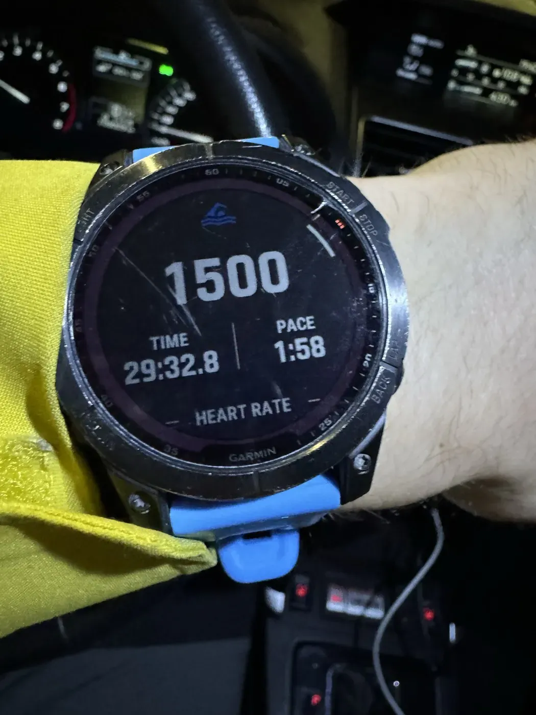
Straight off the wrist: 1,500 m in 29:32.8, read in the car park before driving home.
Every number in this article started life exactly like this one, as a single session on a watch. The only thing I added is four years of patience and a bit of curiosity about what the pile of sessions actually says.
The prehistory: before Total Immersion
While writing this article I imported one more archive: my Apple Health export, and it pushed the story back before the Garmin existed. The first swim I ever recorded is from November 15, 2021, on an Apple Watch: 33 minutes in the water, average heart rate 98, and no distance at all, because the watch was not even set up for the pool yet. The next day looks the same. That is what an absolute beginning looks like in data.
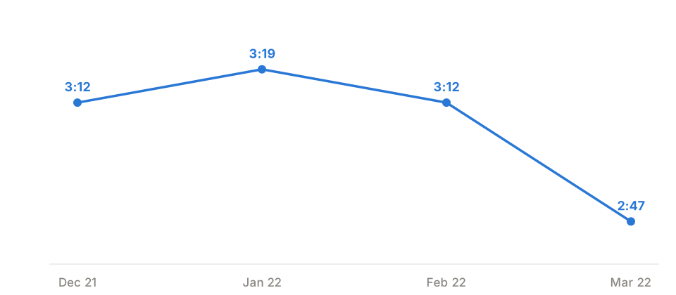
November itself I will not chart, and the reason is this article's whole lesson in miniature: those were swim lessons, full of drills and standing at the wall, and the watch missed most of the metres. One recording claims 400 m took 28 minutes. Averaging that era would measure how long the coach talked, not how fast I swam. So the chart starts with December and shows the best session of each month: 3:12 per 100 m, still around 3:12 in February, 2:47 by the end of March. Sessions of 300 to 1,000 metres, before Total Immersion. Everything else in this article, the whole 2:29 to 1:47 arc, starts from here.
Two more honesty notes. It is a different watch and a gross pace (elapsed time over distance), which is why it gets its own chart instead of being glued onto the Garmin trend. And the Apple archive overlaps the Garmin years, the same swims logged twice, so it is used here only for the months before the Garmin arrived.
The headline: faster at the same heart rate
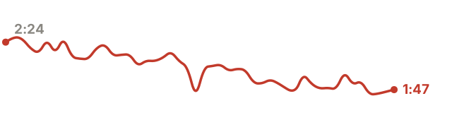
Here is the pace chart, one point per year, averaged over real pool sets of 400 m or longer.
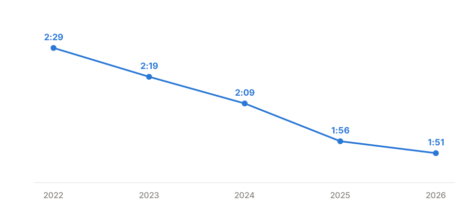
On its own, a falling pace line proves nothing. You can swim faster by simply trying harder, and the chart looks identical. The line that gives it meaning is this one:
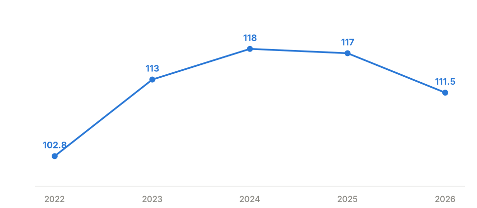
Average heart rate in the pool stays inside a narrow band, 103 to 117 bpm, across all four years, and 2026 sits lower than 2024. Nothing there can explain a 25 percent pace gain. Pace improved by more than half a minute per 100 m at essentially the same cardiovascular cost.
That combination has exactly one reading: efficiency. The speed did not come from pushing harder, it came from wasting less. This is the single most useful cross-check in your own data: never read a pace trend without its heart rate trend next to it.
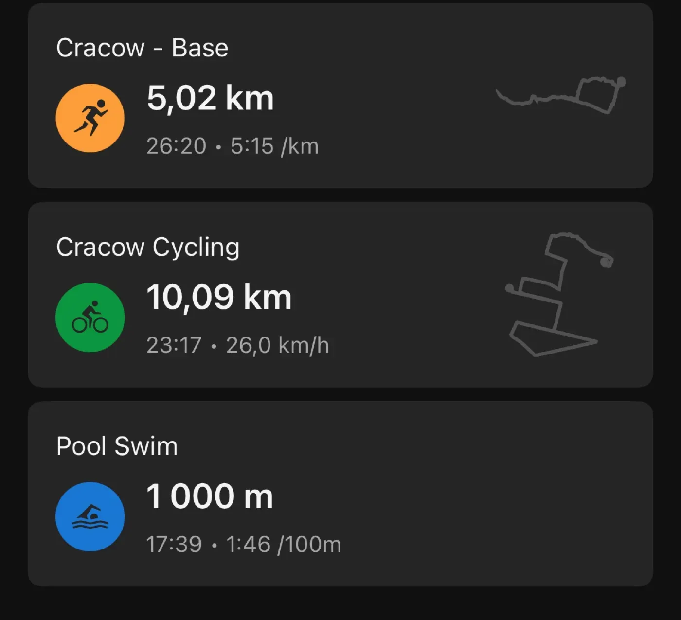
And this is what those numbers look like in the wild: an ordinary training day in Garmin Connect. A 5 km run, a 10 km ride, and a 1,000 m pool swim at 1:46 per 100 m, right where the trend line says it should be.
No race, no taper, no special effort. The trend is just what an average day looks like now.
SWOLF, the honest technique score
SWOLF is seconds per length plus strokes per length. It punishes both slowness and thrashing, which makes it hard to cheat: you cannot buy a better SWOLF with effort, only with technique. Its close cousin is SPL, strokes per length, which we covered in depth in SPL: the hidden metric that transforms your swimming.
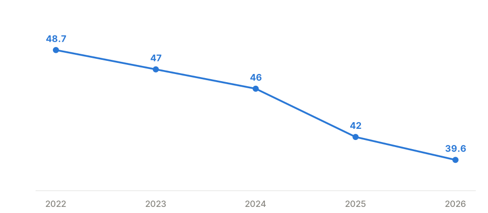
Mine went from 48.7 to 39.6 as a yearly average, and it fell every single year; my best single month so far averaged 36.8. Month to month the number jumps around, drill blocks bump it up and technique blocks pull it down, which is exactly why the yearly average is the honest view: the direction over years is what counts.
Volume: consistency beats heroics
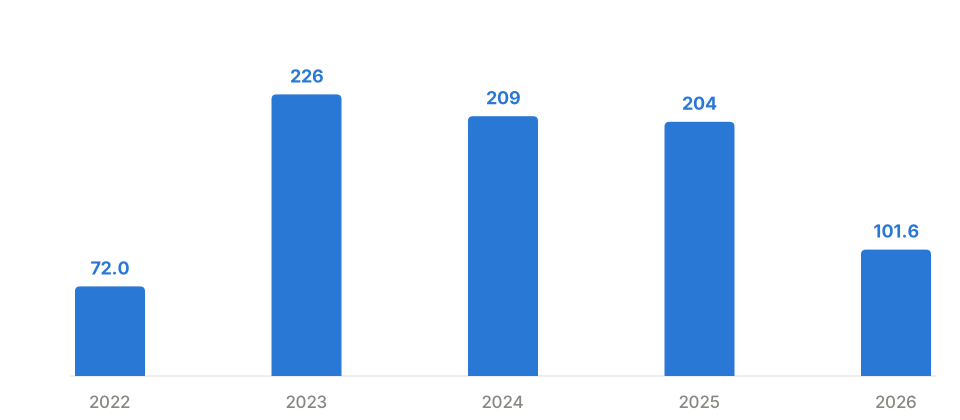
The volume chart is the least dramatic and the most important. There is no heroic year. The whole transformation was built on roughly 200 km a year, month in month out, swum on 587 separate days. My longest streak was 8 consecutive swim days; my longest single swim was 10.07 km.
One detail I like: I swam that 10 km twice, in November 2023 and again in March 2025. The second one was 16 minutes faster. Same distance, same pool, sixteen months of technique between them.
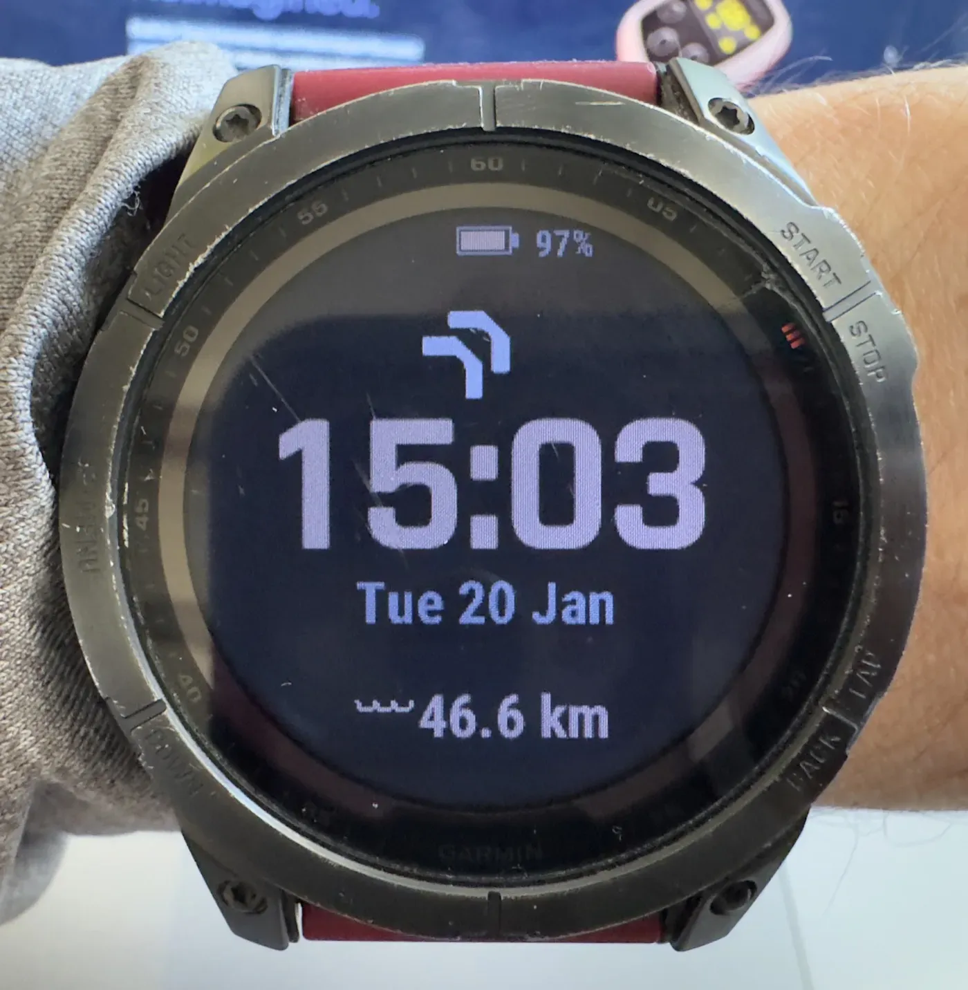
The swim counter sits on my watch face on purpose: 46.6 km on the widget the day this photo was taken.
Seeing the kilometres add up is a small, constant nudge, and consistency is the whole trick. If your watch supports a swim distance widget, put it where you will see it every time you check the hour.
Where the open water happened
The pool built the technique; the open water is where it gets spent. Every open water swim carries a GPS start point, and 173 of them draw this map: a dozen lakes, mostly Polish, with the Kashubian lakes around Stężyca as the clear home base at 60 swims and 62 km, and four different seas, from the Baltic to the Atlantic.
The body keeps the score: VO2max, resting heart rate, weight
Everything above is swim mechanics. The physiology should agree with it, and it does.
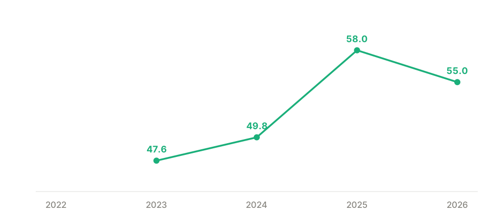
The chart shows the last reading of each year, but the full range is wider still: my first recorded value was 37.8 in January 2023, and the peak was 60.4 in May 2026, a gain of more than 20 points. One honesty note: Garmin only recalculates VO2max after qualifying outdoor runs and rides with heart rate, so a swimmer's VO2max updates only in the periods you happen to run. 2022 has no value at all for exactly that reason. The quiet stretches are not missing fitness, they are missing samples.
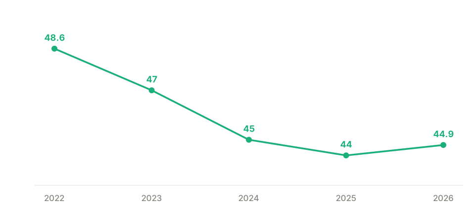
Resting heart rate settled from around 48 to the mid 40s bpm. Slow, boring, and exactly what you want to see next to a flat in-pool heart rate: the engine got bigger, so the same output costs less.
The scale agrees. When I started swimming I weighed 84 kg, and today's weigh-in says 72.5 kg: eleven and a half kilograms over the whole journey. I will not pretend the pool did that alone: alongside the training I changed how I eat, mostly by cutting back on sugar. No crash diet, no counting, just swimming plus one sustainable habit change, held for four years. One honesty note on this chart: the 84 kg starting point predates the watch, it is the one remembered number here; everything after it comes from logged weigh-ins, occasional and manual in the early years, daily from a smart scale since mid 2025.
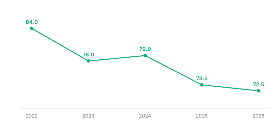
None of these three curves knows about the others. Different sensors, different days, different mechanisms. They all bend the same way, and that agreement is the strongest evidence a consumer device can give you that the change is real.
Four years in one chart
Every trend above on a single axis: each metric shown as percent change since its first recorded year. Down is better for pace, SWOLF, resting heart rate and weight; up is better for VO2max.
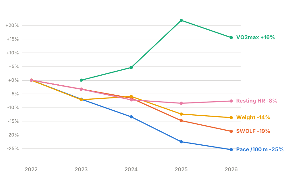
Five metrics, different sensors, different units, one picture. Every line bends the right way. Faster, more efficient, fitter, lighter, on roughly 200 km a year.
How to read your own data without fooling yourself
Getting the charts is the easy half. Reading them honestly is the half that matters, and my own data had three traps in it.
The second trap is small samples. One of my months shows a spectacular 1:40 average pace. It contained four short swims. A month with four data points is an anecdote, not a trend.
The third is gaps. My wellness history had two long holes, 435 days in total, where the sync simply never ran. Before drawing these charts I backfilled every one of those days from Garmin, and the missing months turned out to hold the best part of the story: my true VO2max starting point of 37.8. When a hole cannot be filled because no measurement ever existed, say so next to the chart instead of letting the line quietly pretend.
What the file still cannot tell me
There is one number this whole archive is missing: the tempo I was actually swimming to. My pace and SWOLF improved most during blocks of deliberate rhythm work, but the rhythm itself was never in the file. Garmin swim profiles do not record external tempo trainers.
That gap is exactly why we built the Vimo Swim Field, which writes the tempo from your Vimo into the FIT file as developer fields: a per-second tempo trace, per-lap averages, and session totals. This is what it looks like once the data is in the file: a 50-minute session against a steady 50 spm beat, 2,517 metronome beats recorded, with the heart rate trace right underneath it.
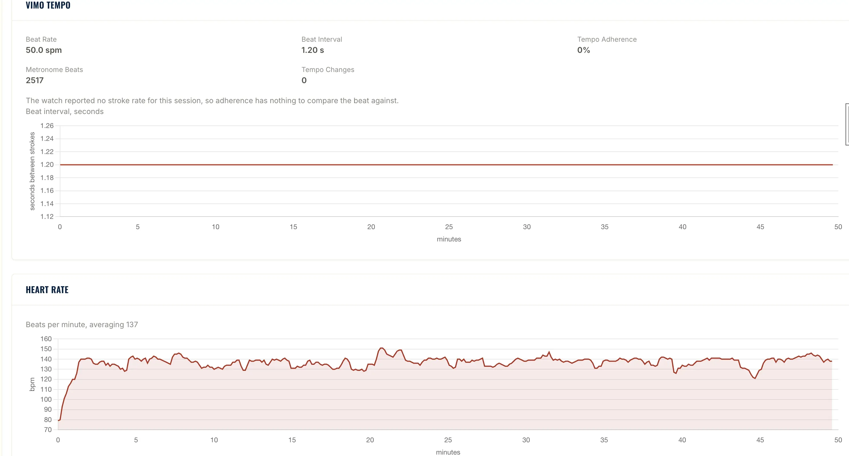
The next four years of this dataset will contain the one variable the first four were missing.
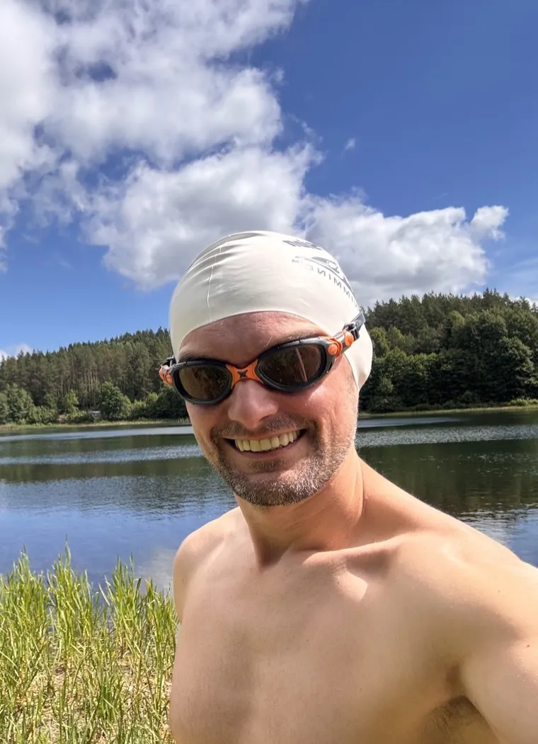
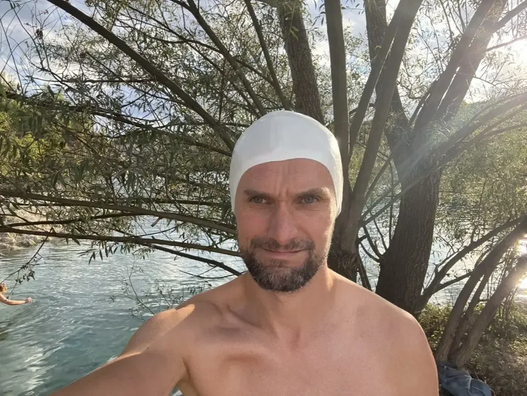
And this is what all those charts add up to: cap on, goggles on, at the water's edge, eleven and a half kilograms lighter and a minute per hundred faster than the person who started. Your watch has been keeping this diary for you all along. It is worth learning to read it.
One last confession. I am an IT engineer by training, so data is close to my heart and, honestly, it motivates me. But some of my best swims never made it into any chart, because every now and then it is worth leaving the watch in the bag and just swimming.
Mariusz, Founder at Vimo Swim
Kaszuby, August 2026: Another Real Group Test of the Vimo Tempo Trainer
Three years of building, three lakes, and a device on every swimmer. What the August Kaszuby camp taught me about the Vimo tempo trainer, from a display that was too dark in bright sun to a feature I never planned.
Three Years Later, I Kept My Promise: Vimo Swim in Alicante
Rafa was one of the first coaches who told me this device should exist. In September 2026 I came back to Spain and gave him the first two Vimo devices.